Investing in Nepali stocks is growing rapidly as more people are eager to participate in the stock market. However, understanding how to read stock charts remains a big challenge for many beginners. Stock charts are one of the most important tools for any investor because they visually represent how stock prices have moved over time. They help you understand market behavior, spot trends, and decide when to buy or sell shares. Without this skill, investing becomes more of a gamble than a smart strategy. In this guide, you will learn everything you need to read stock charts for Nepali companies, explained simply with helpful Nepali explanations. By the end, you will be able to analyze charts confidently and take better investment decisions.
What Is a Stock Chart and Why Should You Care?

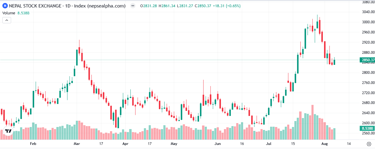
A stock chart is a graphical representation that shows the price movements of a company’s shares over a period of time. The chart has two main axes: the horizontal axis (called the X-axis) which shows time intervals such as days, weeks, or months, and the vertical axis (called the Y-axis) which shows the stock price levels. Beneath the price chart, you often see volume bars that represent how many shares were traded during each time period. This volume information is crucial because it confirms the strength or weakness of price movements.
For Nepali investors, stock charts are especially valuable because accessing detailed financial reports and real-time market news can sometimes be difficult. Charts give a quick visual summary of what is happening in the market. When you know how to read them properly, you can spot patterns and signals that help predict future price movements.
नेपालीमा: स्टक चार्ट भनेको कम्पनीको शेयर मूल्य कति समयदेखि कति भयो भनेर देखाउने ग्राफ हो। यसले लगानीकर्तालाई बजारको वर्तमान र भविष्यको दिशा बुझ्न सहयोग गर्छ।
Different Types of Stock Charts You’ll Encounter
There are mainly three types of stock charts that investors use worldwide and in Nepal:
Line Charts
Line charts are the simplest form of stock charts. They connect the closing prices of a stock over a period with a continuous line. This type of chart is good for beginners because it clearly shows the general trend of prices over time. However, it does not give detailed daily price information like highs, lows, or opening prices.
Bar Charts
Bar charts are more detailed than line charts. Each bar represents one day’s trading activity and shows four key prices: opening, highest, lowest, and closing price. These bars help investors see price ranges within a day and better understand market volatility. Reading bar charts can take some practice because you need to interpret each bar’s shape and position.
Candlestick Charts
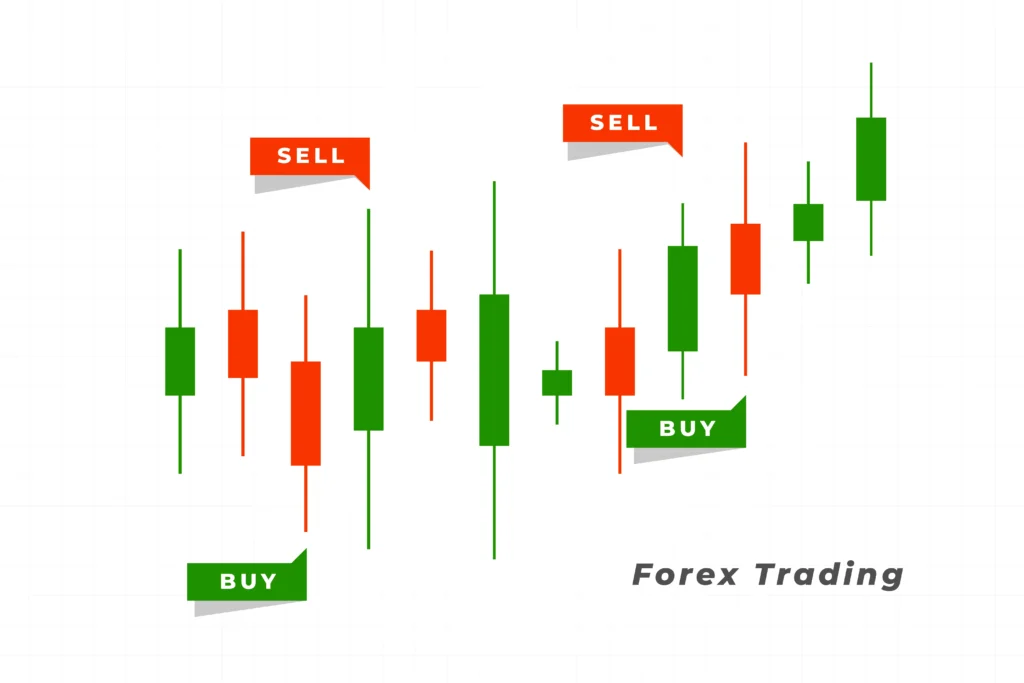
Candlestick charts are the most popular among Nepali investors. They display the same four prices as bar charts but use a “candle” shape that is easier to visualize. Each candle has a body and wicks (also called shadows). The body shows the opening and closing prices, while the wicks show the day’s highest and lowest prices. The candle’s color shows whether the price went up or down: green means the price closed higher than it opened (bullish), and red means the price closed lower (bearish).
नेपाली बजारमा सबैभन्दा बढी चल्ने चार्ट क्यान्डलस्टिक चार्ट हो किनभने यसले मूल्यको उतारचढाव सजिलै बुझ्न मद्दत गर्छ।
How to Understand Candlestick Charts in Detail
Anatomy of a Candlestick
A candlestick contains four main pieces of information:
- Body: The thick part shows the opening and closing prices.
- Upper Wick: The thin line above the body shows the highest price of the day.
- Lower Wick: The thin line below the body shows the lowest price of the day.
- Color: Green (or white) indicates the price went up; red (or black) indicates the price went down.
The size of the body and wicks tells a story about market sentiment. A long body means strong buying or selling pressure, while a short body shows indecision. Long wicks suggest that the price tried to move higher or lower but was pushed back by buyers or sellers.
Interpreting Candles for Trading Decisions
- A long green candle usually means buyers are in control and the price is rising strongly.
- A long red candle means sellers are dominating and the price is dropping.
- A small-bodied candle with long wicks, such as a Doji, shows indecision, where buyers and sellers are balanced.
नेपालीमा: क्यान्डलको रंग र आकारले बजारमा कति दबाब छ भन्ने जनाउँछ। लामो हरियो क्यान्डलले मूल्य बढेको संकेत गर्छ भने रातो क्यान्डलले घटेको।
Recognizing Market Trends Using Stock Charts
Prices in the stock market move in trends. Understanding these trends helps investors decide when to buy and when to sell:
- Uptrend: When prices form higher highs and higher lows over time, it means buyers are strong and the market is bullish.
- Downtrend: When prices form lower highs and lower lows, sellers dominate, and the market is bearish.
- Sideways or Range-bound Market: When prices move within a narrow range without clear direction, the market is uncertain.
You can identify these trends by observing the peaks and troughs on the chart. For example, in an uptrend, each peak is higher than the previous one.
नेपालीमा: बजार उकालो, ओरालो वा स्थिर अवस्थामा रहन्छ। यी अवस्थाहरूलाई बुझेर सही समयमा लगानी गर्न सकिन्छ।
Importance of Trading Volume in Stock Charts
Trading volume indicates how many shares changed hands during a certain time. It is an important confirmation tool:
- High volume along with rising prices shows strong buying interest.
- High volume with falling prices indicates strong selling pressure.
- Low volume may signal weak price movements or uncertainty.
Volume helps verify whether a price move is reliable or not. For example, if a price rises but volume is low, the move may not last.
नेपालीमा: धेरै शेयर किनबेच हुँदा मूल्यको उतारचढाव बलियो हुन्छ। भोल्युमले बजारको विश्वासको संकेत गर्छ।
Common Candlestick Patterns Every Nepali Investor Should Know
Candlestick patterns are combinations of one or more candles that give clues about future price movements. Here are a few common patterns:
- Doji: The open and close prices are almost equal, showing market indecision. It can signal a potential reversal.
- Hammer: A small body with a long lower wick, often appearing after a downtrend and indicating a possible upward reversal.
- Engulfing Pattern: A large candle that completely covers the previous candle’s body, signaling a strong change in market direction.
Recognizing these patterns can help you anticipate market moves and make better decisions.
नेपालीमा: यी पैटर्नहरूले बजारको दिशा परिवर्तनको संकेत दिन सक्छन् जसले लगानीकर्तालाई निर्णय गर्न सजिलो बनाउँछ।
Best Online Tools for Nepali Stock Chart Analysis
Several websites offer stock charting tools and market information for Nepali investors:
- NEPSE Official Website (https://www.nepalstock.com): Provides basic price data and simple charts.
- TradingView (https://www.tradingview.com): Offers advanced interactive charts with many technical indicators and Nepali stock data.
- Money Control Nepal: Good source for market news and company updates.
These tools help you track stock prices, analyze charts, and stay updated with market trends.
नेपालीमा: यी वेबसाइटहरूले शेयर बजारको जानकारी सजिलै पाउन सहयोग गर्छन् र लगानी निर्णयमा सहयोग पुर्याउँछन्।
Practical Tips to Improve Your Stock Chart Reading Skills
- Review charts of different Nepali companies daily to get familiar.
- Combine chart reading with financial news and company reports for a complete view.
- Use volume as a confirmation tool to avoid false signals.
- Stay patient and avoid emotional decisions based on short-term price movements.
Consistent practice will improve your confidence and accuracy in reading stock charts.
नेपालीमा: दैनिक अभ्यास र खबरसंगै चार्ट पढ्नाले लगानीमा सफल हुन मद्दत गर्छ।
Frequently Asked Questions (FAQs)
Q1: Which stock chart type is easiest for beginners in Nepal?
Candlestick charts are best because they show detailed price movements in an easy visual format.
Q2: Why is volume important in stock trading?
Volume confirms the strength of price moves; high volume means strong buying or selling interest.
Q3: Can I trade only by looking at charts?
No, combining charts with company fundamentals and news gives a clearer picture.
Q4: Where can I find Nepali stock charts online?
NEPSE official website and TradingView are popular and reliable sources.
Conclusion
Learning how to read stock charts is a vital skill for anyone serious about investing in Nepal’s growing stock market. These charts provide insights into price movements, market trends, and investor sentiment. By using the right charts, understanding candlestick patterns, watching volume, and practicing regularly, you can improve your investment decisions and reduce risks.
This guide aims to give you the knowledge and confidence to start analyzing stock charts for Nepali companies effectively. Keep learning, stay updated with market news, and always combine chart analysis with solid financial information to invest smartly.
नेपालीमा: स्टक चार्ट पढ्न जान्नु भनेको लगानीमा सफलताको आधार हो। यसले बजारको सही दिशा बुझ्न र राम्रो निर्णय लिन सहयोग गर्छ।